I’m going to start with a bold personal statement, Branding and more specifically, using your brand elements for marketing purposes, is my favourite part of this industry. There’s so much to branding that you can fall in love with, whether that be the ability to have your audience cling to your every word, the opportunity to make your audience laugh, smile, cry or empathise. It might even simply be learning the skill to produce some beautiful Ad creative.
Whatever you love about branding, there’s one element that simply has to be implemented – Using Brand Guidelines!
Now before I start talking about how to create and use Brand Guidelines, we should probably cover some basics.
What even is a brand anyway?
If this is a new topic to you, you’d be forgiven for thinking of a brand as any of the following:
- Name
- Slogan
- Design
- Colour
- Logo
You’d be forgiven because you’d be right, these are all elements of brand identity. But let’s be clear, these are the face of a brand, certainly not the heart and soul of a brand. The funnel below should start to give you an idea of the deeper considerations around the identity of your business.
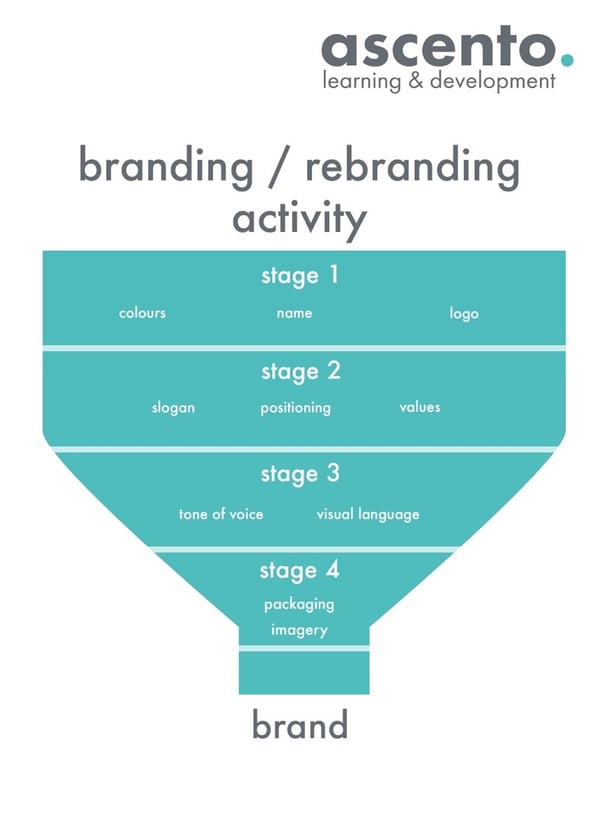 You can see that aspects such as tone of voice, imagery and visual language are the much more in depth aspects of your brand.
However, despite this, you need to ensure that you have consistency across all these elements in order to build a strong brand identity. Let me just stress that word one more time – Consistency. It really is both that simple and that important. Think about it, picture an advert from a company you love – at what stage of watching that advert do you need to see a logo or company name or slogan in order to know who it belongs to? The answer you’re looking for is ‘not very long, Jack.’
How do you ensure your brand identity stays consistent? This is where I direct you back to the entire reason you’re here! Create some strong and personalized Brand Guidelines.
How to Create Brand Guidelines
Firstly you need to think about the documents purpose – are you a small company? A startup? Or are you a multi-site business across the country? Your brand guidelines will need to vary on levels of detail. For most small businesses something easy to ready is often the best route, for bigger companies, especially those operating across multiple locations, need something more detailed.
So what goes into your document?
Logo Design
Don’t complicate things – don’t show your logo with it’s intended colours and then it’s “fun, spooky Halloween” colours (it’s not fun or spooky, for the record.) Don’t show your logo inverted or provide multiple options – let me say this loudly for those of you at the back – Keep it simple. Keep it consistent. You want your logo to be recogisable, and that means the same version needs to be seen at least 90% of the time.
If you feel your business is known and you have a strong reputation, now you can include some variations such as a vertical version or a thumbnail version. But this has to relate directly back to your key logo. Don’t create a new version just for this varying layout.
Font & Colours
Your digital and physical presence need to be recognisable without your logo present. If you can achieve this, you’ve got a successful brand. A great way to have people recognise your company is through a distinctive font and the colours associated with it.
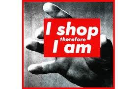
This image is from an American artist called Barbara Kruger. Depending on your interests, it may or may not look familiar. If you are looking at this image and recognize the colours and text, you’ll be doing so because it is famously used for New York based skate and streetwear brand, Supreme.
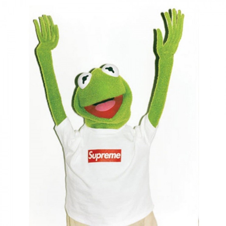
Not only does this emphasise my point of a strong and consistent logo, it also means that the red box and white text (if you’re a Supreme fan) becomes only Supreme. They could write anything in there, and it wouldn’t look out of place.
Top tip: Know your hex colour. Memorise it. Use it. Memorise it.
Tone of Voice
This is crucial and one of the more rewarding elements you can focus on. A good tone of voice should be identified by three descriptive words. I could say ‘Informal, Quirky, Amusing’ and that should give you a pretty good idea of what that person/company would sound like, but you can take this further. You could specify how you wanted to be informal, such as ‘No punctuation or grammatical rules such as capitalisation of headers.’
You might also want to include your own example phrases in comparison to standard English. For example:
They say ‘Assistance’, but we say ‘Help’. They say ‘Obtain’, but we say ‘Get’. This will really help others in your business understand and visualise the tone that you want to come across. Which is particularly important if you expect others to write in the tone that you’ve created.
I have one big request when it comes to thinking about what your tone of voice should be – please do not use:
- ‘Professional’
- ‘Reliable’
- ‘Trustworthy’
These are not defining assets, these are what every business should already be!
Top tip: Research Oatly. They use their tone of voice better than most. Their distinctive style is consistent across all of their web assets and their physical products also.
Brand Imagery
You may want to create a particular style of image, this should be clear and documented rather than simply hiring a photographer, going with “their style” and consistently using them. The reason the style should be clear and documented is that you may need other photographers to replicate the style, your main photographer may leave the business or have a change of career and your brand identity is then at risk.
You should be able to have a style of both graphic design and photography, as well as video style.
Whatever you decide your style to be, it should also represent your tone of voice. Those three words we chose ‘Informal, Quirky, Amusing’ should be replicated in visual style also and I’m willing to bet you’re already picturing what that looks like or thinking of company’s who already do this well.
The reason those companies are coming to your head is quite simple, because yet again we go full circle and take you back to the whole point of being here, the companies you’re thinking of have really clear Brand Guidelines.
About Ascento
Ascento learning and development specialise in providing workforce development apprenticeship programmes to both apprenticeship levy paying employers and non levy employers. We work closely with employers to identify the key areas for development and design strategic solutions to tackle these with programmes that are tailored to each individual learner. With two schools of excellence focusing on Management and Digital Marketing we don’t deliver every qualification under the sun, but focus on what we know best and ensure that quality is at the heart of everything we do.